Howdy!
I’m very excited about the positive responses my movies have been receiving. It’s a compliment and it is an inspiration to make more. I have some new equipment and I’m so curious and excited about telling wacky stories with new tools.
Gender Reel 2015
I’ve screened movies at GenderReel every year it’s existed – that feels really cool especially since GenderReel has been growing, and gaining more recognition every year. My movie “1987, Summer” is part of this year’s traveling festival. The only screening left in 2015 is in Houston, Texas. I have a special place in my heart for the film community in Texas. At AGLIFF‘s “My Gay Movie” in 2004, “Faggotgirl Does Austin” won “The Weirdest Movie Jenn Garrison Had Ever Seen.” I treasure that award.
Scottish Queer Film Festival: Queer Women In Love
“This November and December, SQIFF is taking part in BFI Love with two programmes of films and events. Queer Women in Love is a diverse and exciting selection of films by and about lesbian, bisexual, and queer women with events across the UK. I Do? considers queerness and marriage marking the one year anniversary of changes to the marriage law in Scotland.”
BFI/Scottish Queer Film Festival’s Women in Love: The Virgin Machine
November 10, 2015
The Glad Cafe, Glasgow, Scotland
“The Virgin Machine”
In this early film by director Monika Treut, wannabe writer and journalist Dorothee leaves Germany for San Francisco searching for her long-lost mother and some insights into the ailment known as love. Encounters with male impersonator Ramona, charming bohemian Dominique, and purveyor of lesbian erotica, Susie Sexpert, result in liberating adventures in sexual self-discovery. When Dorothee surfaces a little dazzled on the wilder shores of the city’s lesbian community, she has discovered her sexuality…and left her illusions of romance behind.
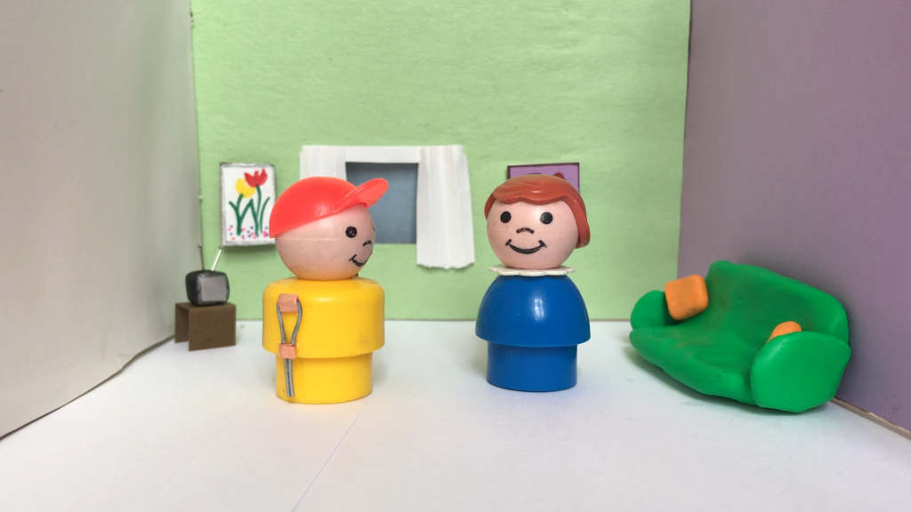
Screening with short films “Fingers” by Sandra Alland, and “1987, Summer””Fingers” features a British Sign Language (BSL) poetry performance by Alison Smith about love, longing, and the sexiness of touch. “1987, Summer” is about a a baby dyke who has landed in a gay resort town during the AIDS crisis. She plays softball, goes clubbing, sleeps with lots of women, and learns about who she is and what she wants.
Part of BFI Love, in partnership with Plusnet bfi.org.uk/love
It is such an honor, and so humbling, that my movie will be screening on World AIDS Day 2015, because it is about me and my friends trying to figure out the world as gay men were dying around us. We were kind of blaming ourselves AND feeling guilty AND trying to not get AIDS AND trying to figure out a political response AND trying to be young, gender-non-conforming people when we had no analysis of gender or trans issues or sexism generally. We did all of that badly, I am sad to say. But I want to talk about that, and see how far we all still have to go on those issues, including a comprehensive response to AIDS.
WORLD AIDS DAY 2015
BFI/Scottish Queer Film Festival’s Women In Love – Go Fish
December 1, 2015
Dundee University Feminist Society.
Room 3G02 within Dalhousie Building.
Go Fish:
Max is a too-cool-for-school young lesbian woman stressing over the fact she hasn’t had sex for ten months. After first dismissing hippy, excessive drinker of tea Ely, Max goes on a date with her, leading to a long-term mutual infatuation and a ‘will they, won’t they’ romantic trajectory. A collaboration between Guinevere Turner (The Watermelon Woman, Itty Bitty Titty Committee) and Rose Troche, Go Fish features a supporting cast of lesbian waifs and strays, including Ely’s sex addict roommate Daria and Max’s roommate Kia, whose girlfriend Evy has been kicked out her home by her homophobic mum.
Screening with short films “Dyketactics” and “Summer, 1987.” “Dyketactics” by Barbara Hammer is a sensuous, bold look at women’s desire and sexuality from a seminal lesbian filmmaker. “Summer, 1987” by Krissy Mahan is set in summer in the late 1980s when a baby dyke has landed in a gay resort town during the AIDS crisis. She plays softball, goes clubbing, sleeps with lots of women, and learns about who she is and what she wants.
Free. Donations will be taken for World AIDS Day.
Part of SQIFF presents: Queer Women in Love, a season of films by and about lesbian, bisexual, and queer women. Part of BFI LOVE, in partnership with Plusnet bfi.org.uk/love
BFI/Scottish Queer Film Festival: Queer Women In Shorts
December 15, 2015
The Royal Vauxhall Taver, London, England
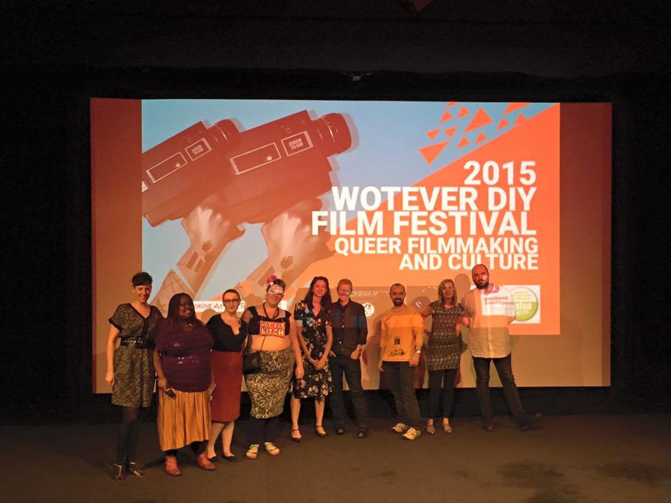
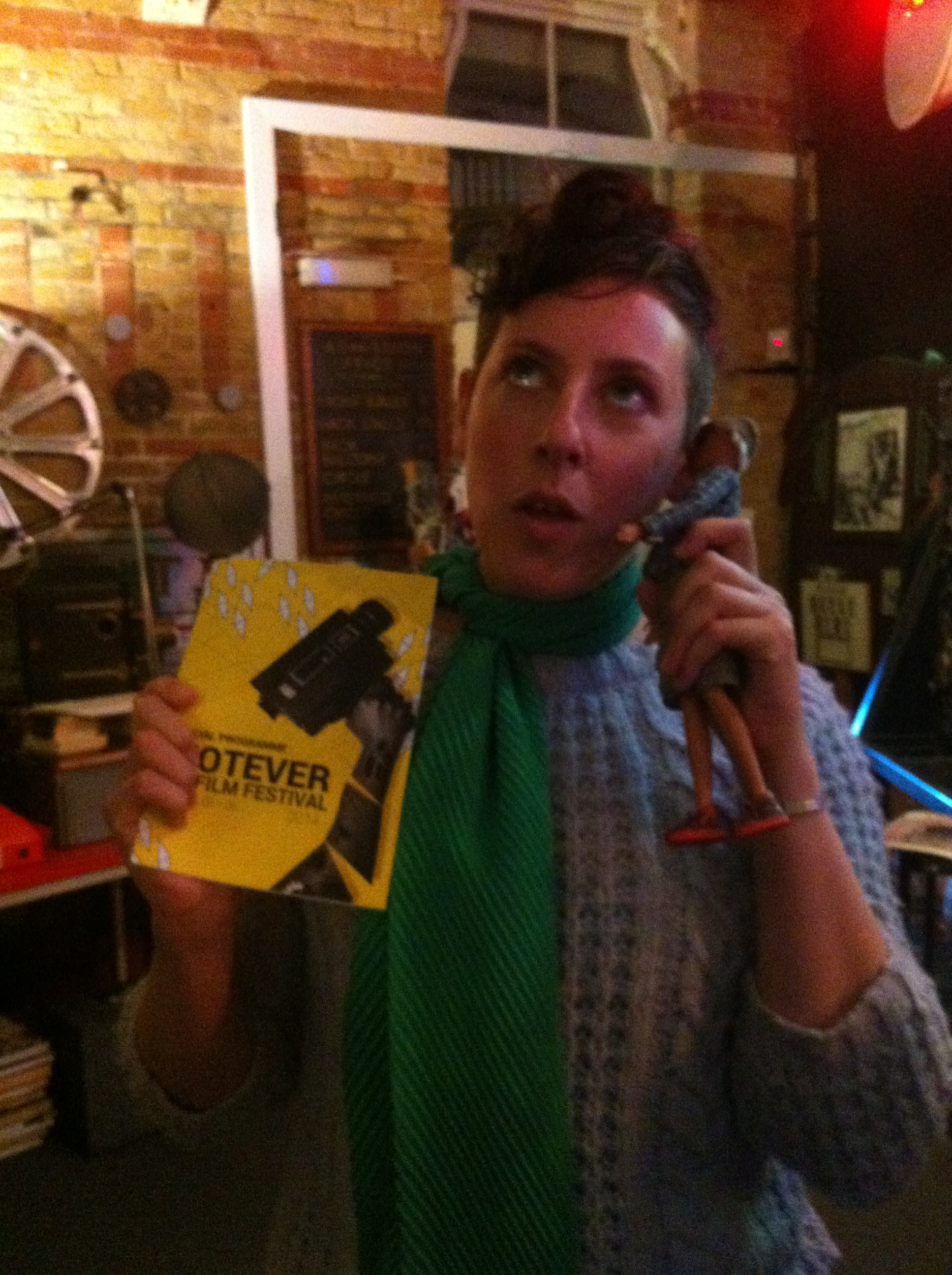
Scottish Queer International Film Festival (SQIFF) in collaboration with Wotever DIY Film Festival and Bar Wotever presents a selection of shorts from SQIFF’s Queer Women in Love season, featuring films by and about lesbian, bisexual, and queer women. The line-up includes a range of styles and ideas relating to the theme of love from Barbara Hammer’s innovative 1970s lesbian experiment Dyketactics to Ami Nashimoto’s vegan, gluten-free date nightmare-comedy Dinner For Two, via queer filmmaking legend Cheryl Dunye’s very first film, Janine, and activist Krissy Mahan’s 1980s-set gay beach town dramedy, 1987, Summer.
With an introduction from SQIFF’s Helen Wright.
This is how accessibility, and information about it, is done well!
Tyneside Cinema is accessible for wheelchairs. Each of the Tyneside’s Cinema’s screens have power assisted doors and dedicated spaces for wheelchair users. If you specifically require tickets for the wheelchair spaces available in our auditoria, you can contact Box Office on 0845 217 9909. There is high contrast signage throughout the building, complete with braille. Tyneside also uses the Phonic infrared headset system to provide amplified sound in their screens. Headsets are available for this service from the Box Office on the ground floor and Tyneside Bar on the third floor.
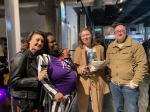
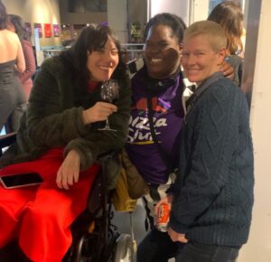
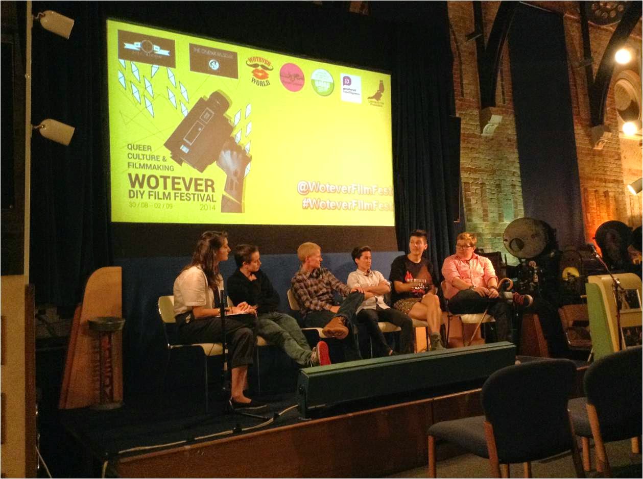
 Hello Friends! Please join me at London’s Cinema Museum on 2 March 2023 for an amazing reunion of filmmakers and festival organizers. Look how far we’ve come! Since the first Wotever DIY Film Festival (my first one was 2013) so many brilliant festivals began, many of them connected somehow to the Wotever DIY Film Festival. My fondest wish is that we can all have some time together, and no one will have to be running a festival, we will all just be hanging out.